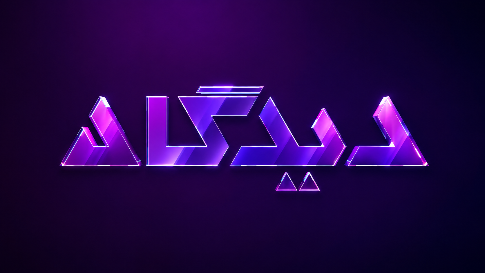
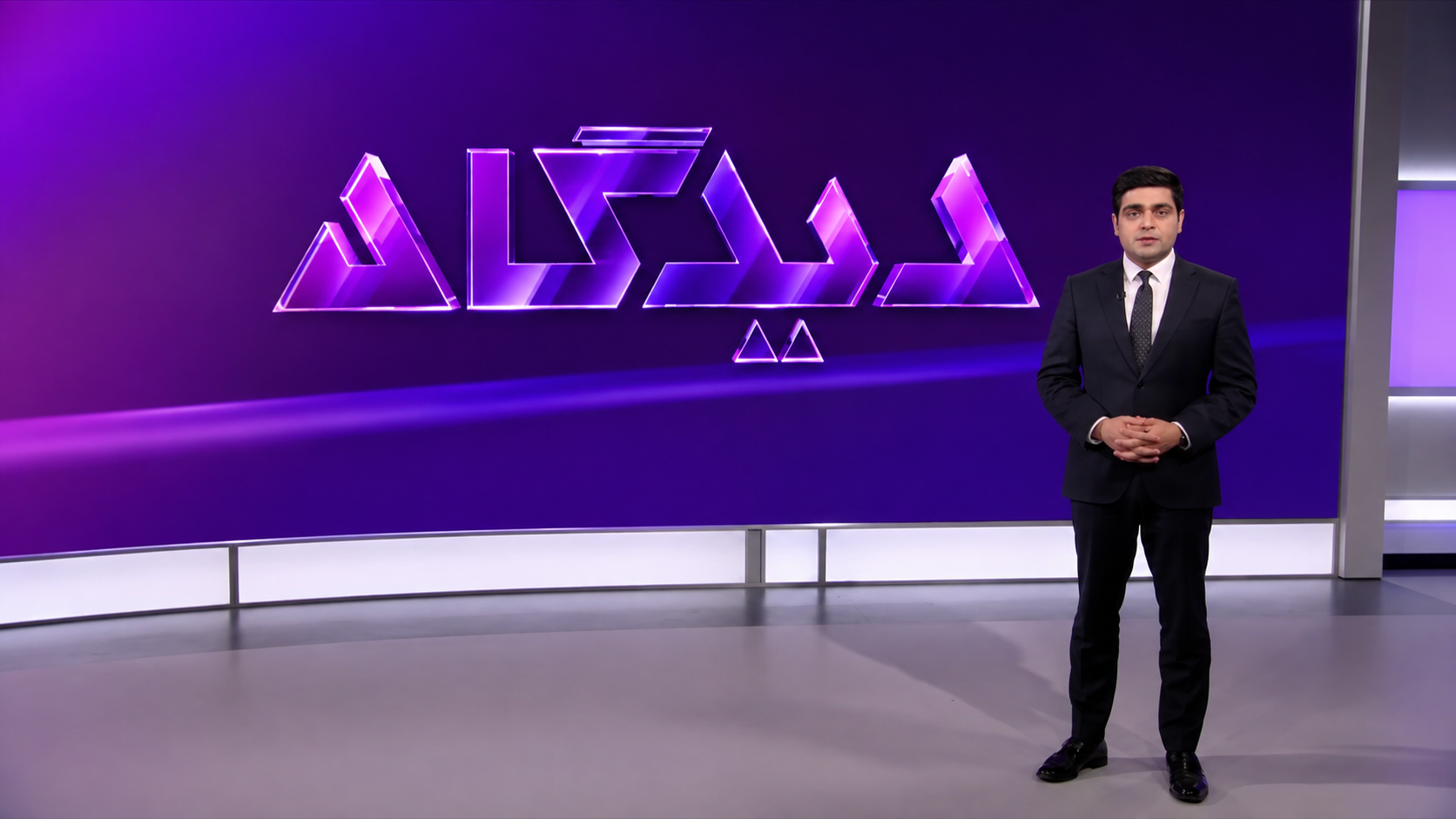
Three-dimensional Didgah Persian logotype illuminated in purple and magenta against a dark background, developed as part of the programme’s broadcast identity.

Graphic Design / Project

Didgah | Broadcast Identity & Visual System.

A broadcast identity and title sequence for Didgah, translating the idea of thesis, antithesis and synthesis into a visual language of geometry, light, depth and motion.

2023Volant Media

Project Story

Didgah was developed as a broadcast identity in which the visual language grows directly from the programme’s central idea: the exchange of different viewpoints.

The identity is structured around the triangle as a symbol of thesis, antithesis and synthesis. Rather than treating the logo as a static graphic, the project explores it as a three-dimensional object emerging from darkness through light, reflection and changing viewpoints.

The title sequence gradually reveals fragments of the identity before resolving into the complete mark. This movement from obscurity towards visibility reflects the programme’s underlying idea: bringing subjects into discussion, examining opposing perspectives and moving towards greater clarity.

Concept

The idea behind the system.

The concept is built around the triangle as a visual representation of thesis, antithesis and synthesis, three positions that reflect the exchange and development of ideas. This geometry became the foundation of the Didgah identity. Through transparency, reflection, darkness and controlled light, the logo is gradually revealed from different viewpoints. The transition from darkness into light acts as a metaphor for discussion itself: moving a subject from uncertainty and ambiguity towards examination, understanding and clarity.

Challenge / Question

What needed to be solved.

How can a broadcast identity visually express the exchange of opposing viewpoints while remaining distinctive, coherent and dynamic on screen? The challenge was to transform an abstract idea, thesis, antithesis and synthesis, into a visual system capable of working across a logo, three-dimensional space and motion, while maintaining clarity and recognition throughout the title sequence.

Approach & Process

How the idea became a system.

The process began by translating the programme’s conceptual foundation into a distinct visual language based on triangular geometry, sharp edges, depth, high contrast and controlled accent colour. The logo was then explored as a three-dimensional form rather than a flat graphic. Transparent, glass-like surfaces and reflective materials were tested alongside different camera angles and lighting conditions to emphasise its geometry and create a sense of depth. For the title sequence, individual details of the logo are revealed progressively through darkness and light. Close viewpoints, reflections and changes in illumination build visual tension before the camera arrives at the complete identity. The motion studies, 3D scenes and lighting tests were developed iteratively to establish a cinematic visual system in which geometry, material, light and movement all reinforce the central concept.

Motion

From identity to broadcast.

Watch the broadcast example

Outcome

The complete visual system.

The resulting identity brings logo, colour, material, lighting and motion together as a unified broadcast language. The final title-sequence direction transforms the Didgah mark into a three-dimensional illuminated environment. Details emerge gradually from darkness, moving through different viewpoints before the complete identity is revealed. The result is a distinctive visual system in which the programme’s central idea, the interaction of thesis, antithesis and synthesis, is expressed not only through the logo, but through the behaviour of the identity in motion.