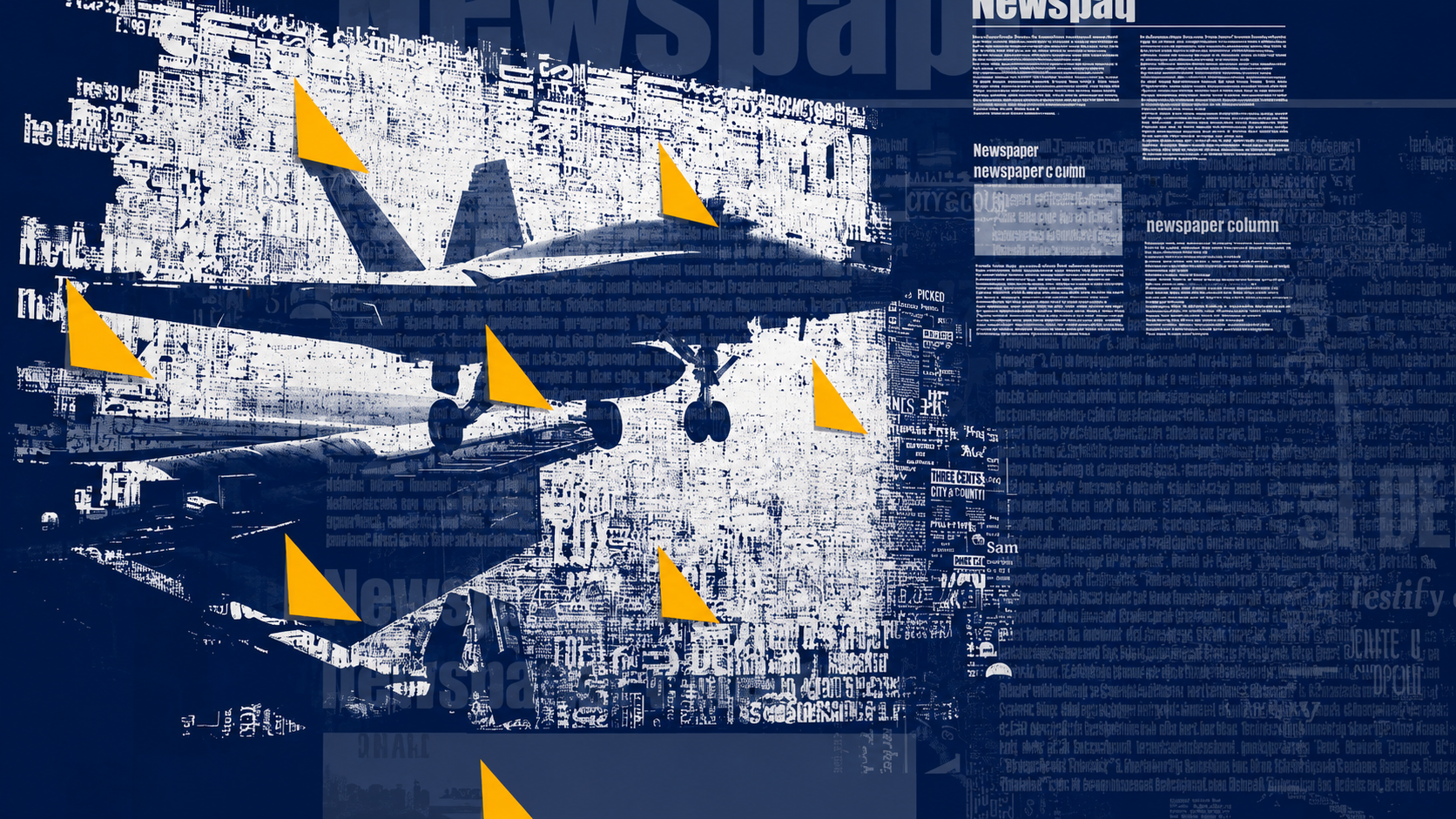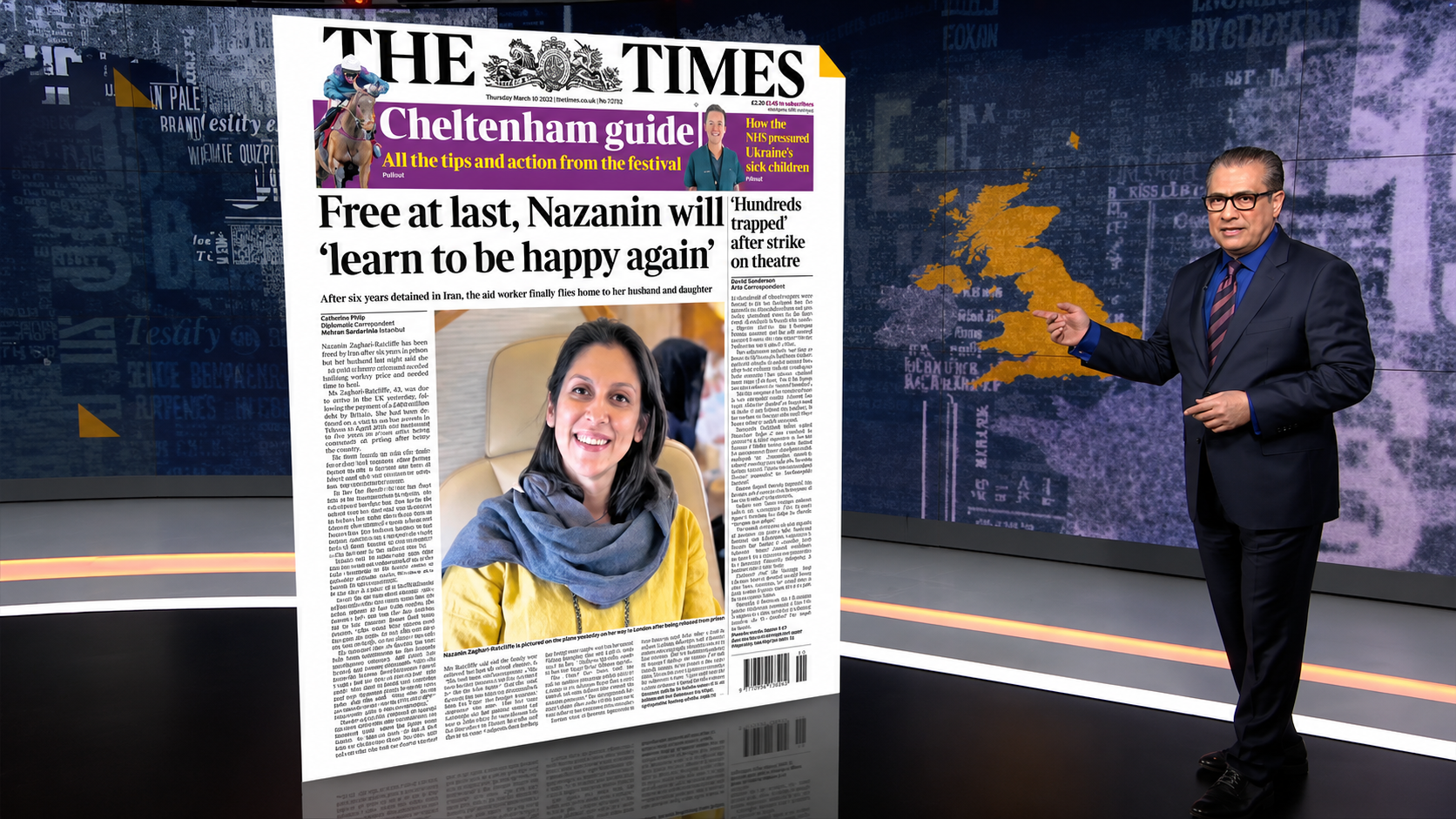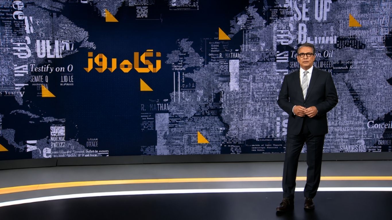
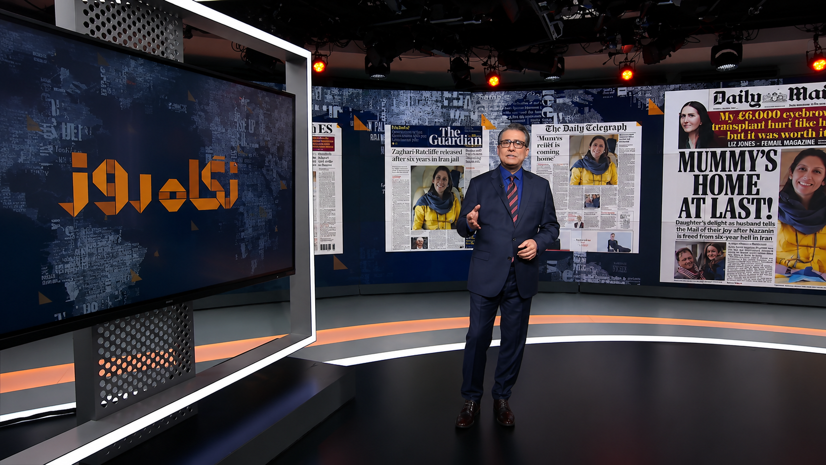
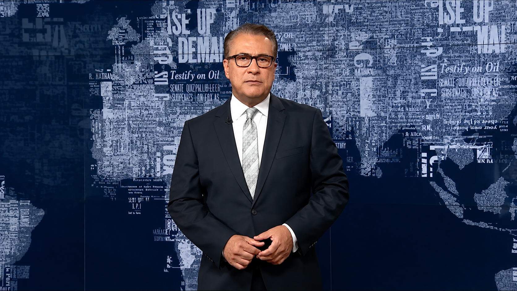
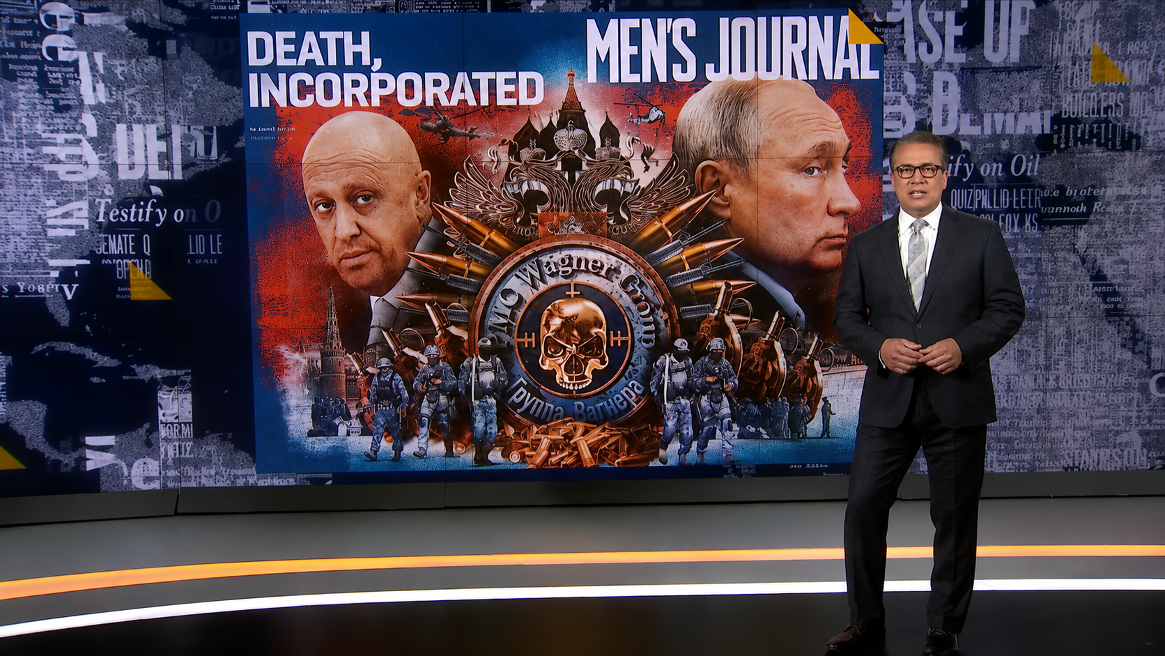
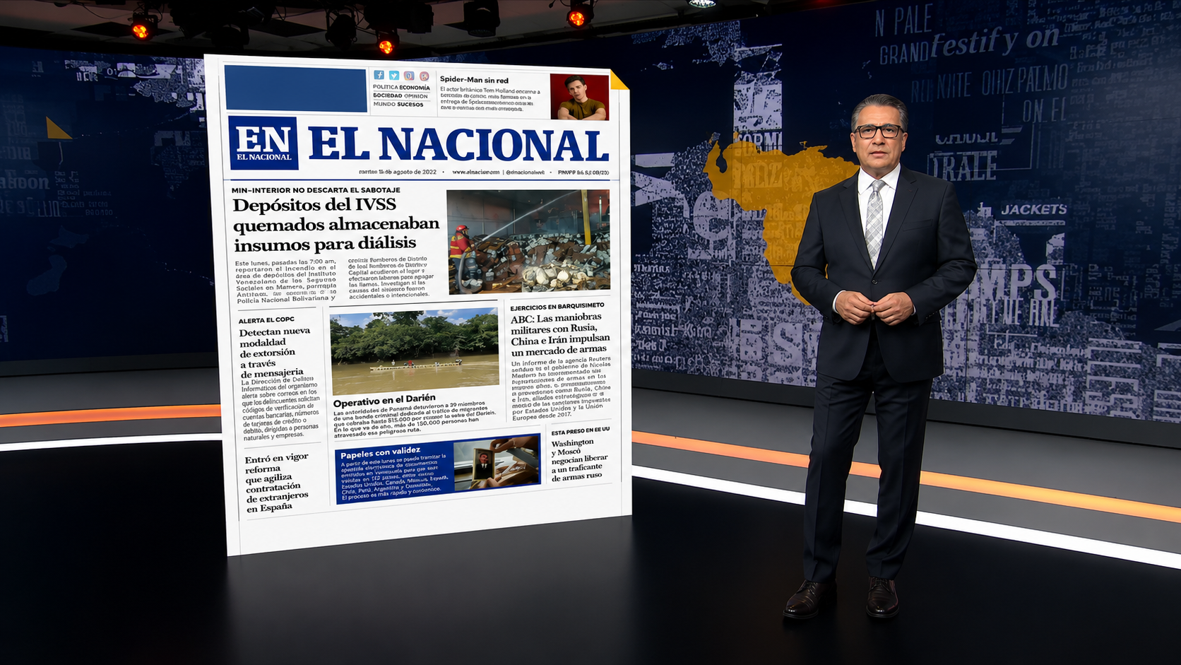
Television presenter standing in the Negahe Rooz studio in front of large-scale video walls displaying a world map constructed from layered typography and newspaper imagery.

Graphic Design / Project

Negah-e Rooz - Broadcast Identity & Visual System.

A broadcast identity and visual system transforming the fundamental materials of publishing, letters and paper into typography, motion, information graphics, studio environments and augmented reality.

2021

Project Story

Negahe Rooz was a television programme centred on newspapers, magazines and published media.

The project called for more than a conventional broadcast graphics package. The aim was to develop a visual language that emerged directly from the nature of the programme itself and could operate coherently across identity, editorial graphics, motion and the physical broadcast environment.

The resulting system began with the fundamental materials of publishing letters and paper and expanded across typographic imagery, a world-map information system, logo and motion graphics, lower thirds, large-scale studio video walls and augmented reality.

Concept

The idea behind the system.

The DNA of Information Is Letters

The identity began with the idea that letters are fundamental building blocks through which information is recorded and transmitted.

Research traced the material history of written and printed language from inscriptions and historical lettering traditions to movable metal type, lithography, printing machinery, newspapers and magazines.

This led to a central design principle:

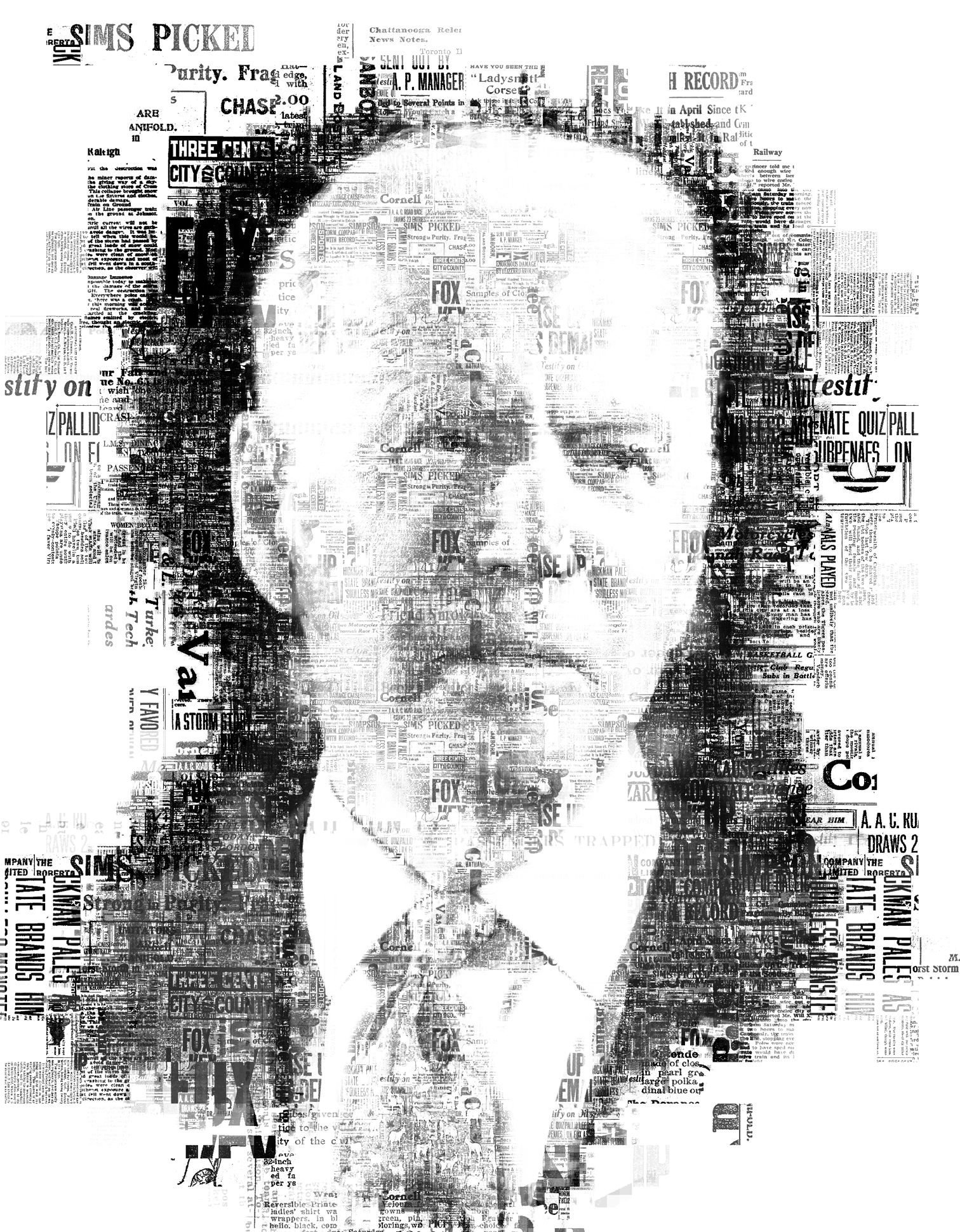
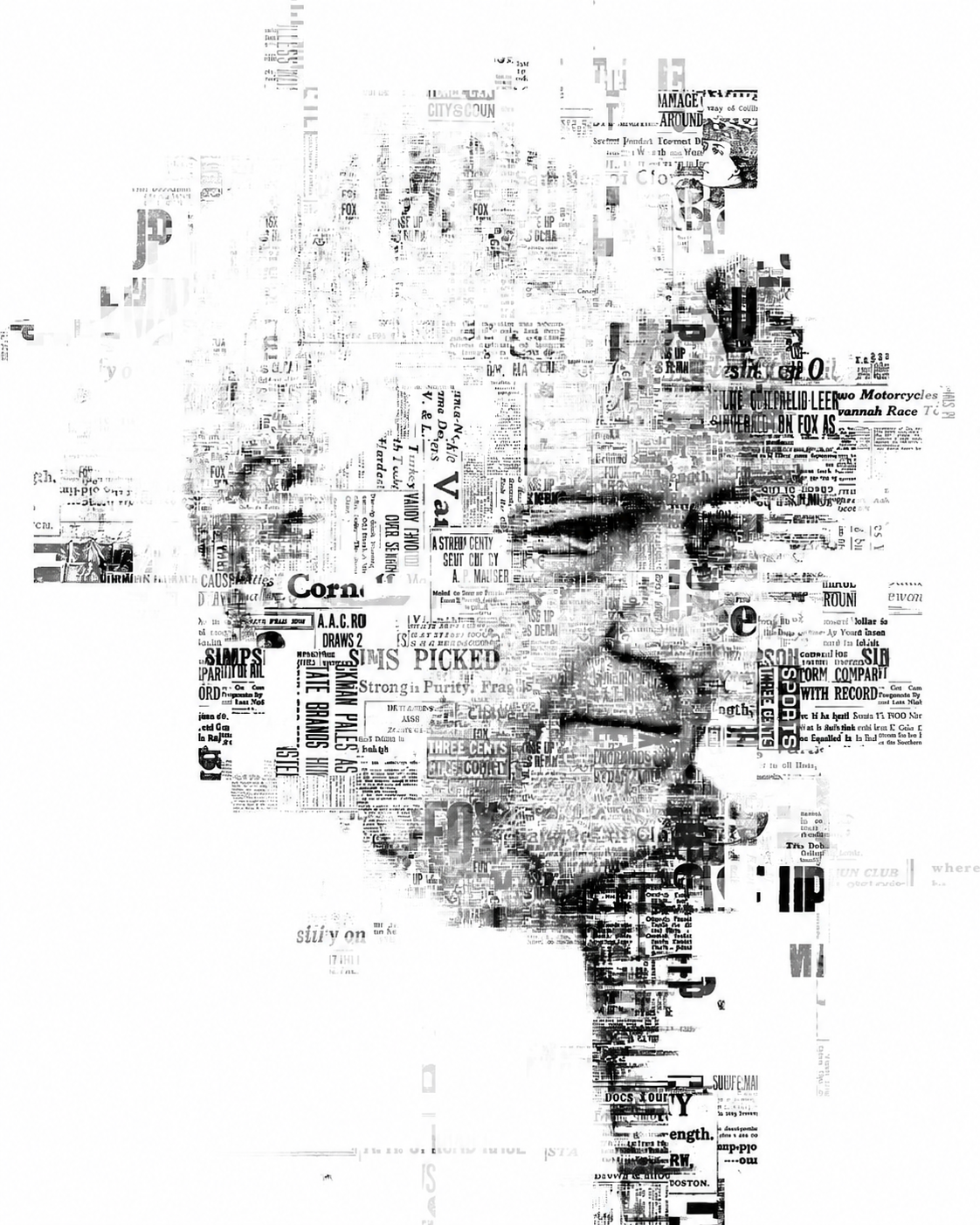
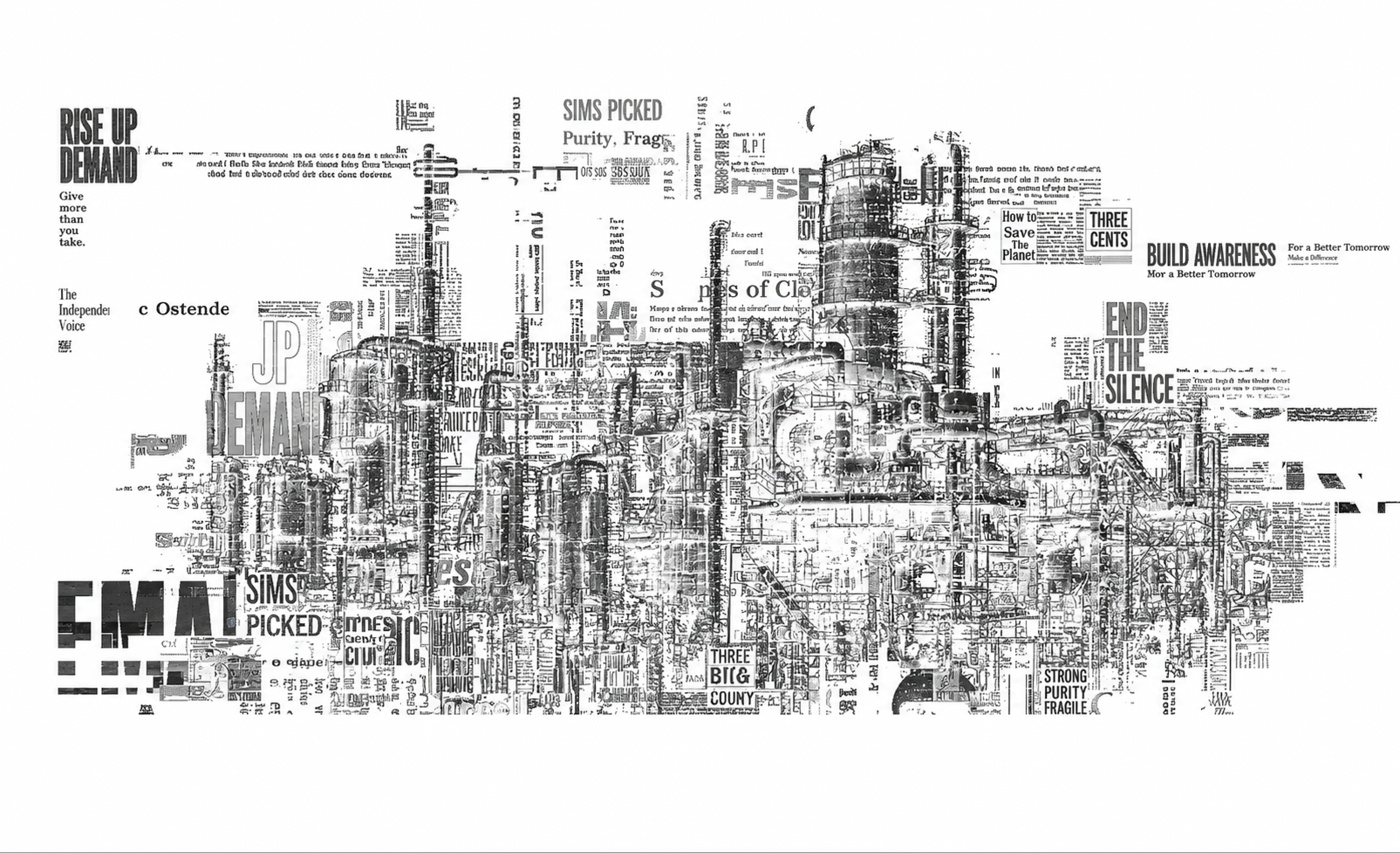
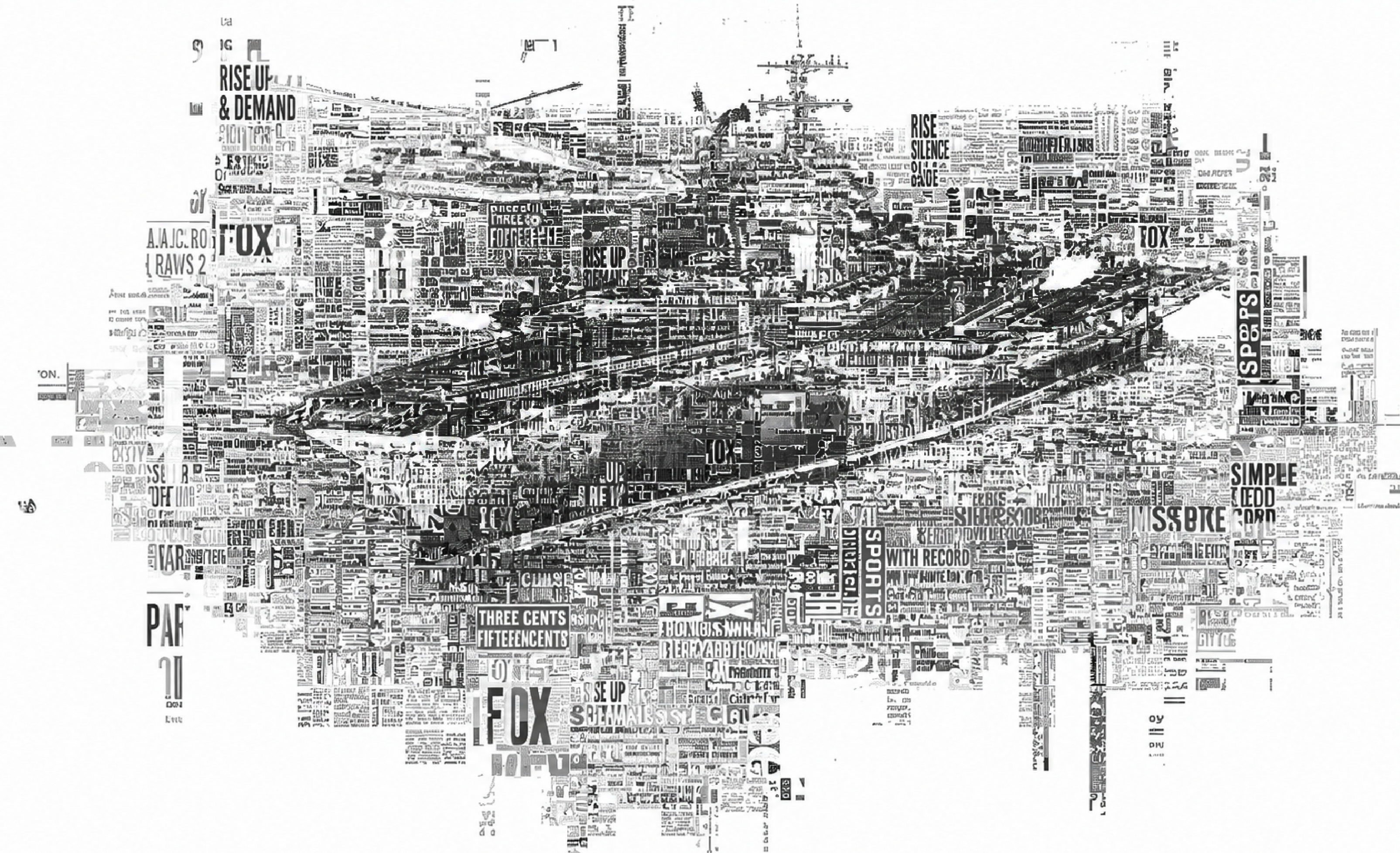
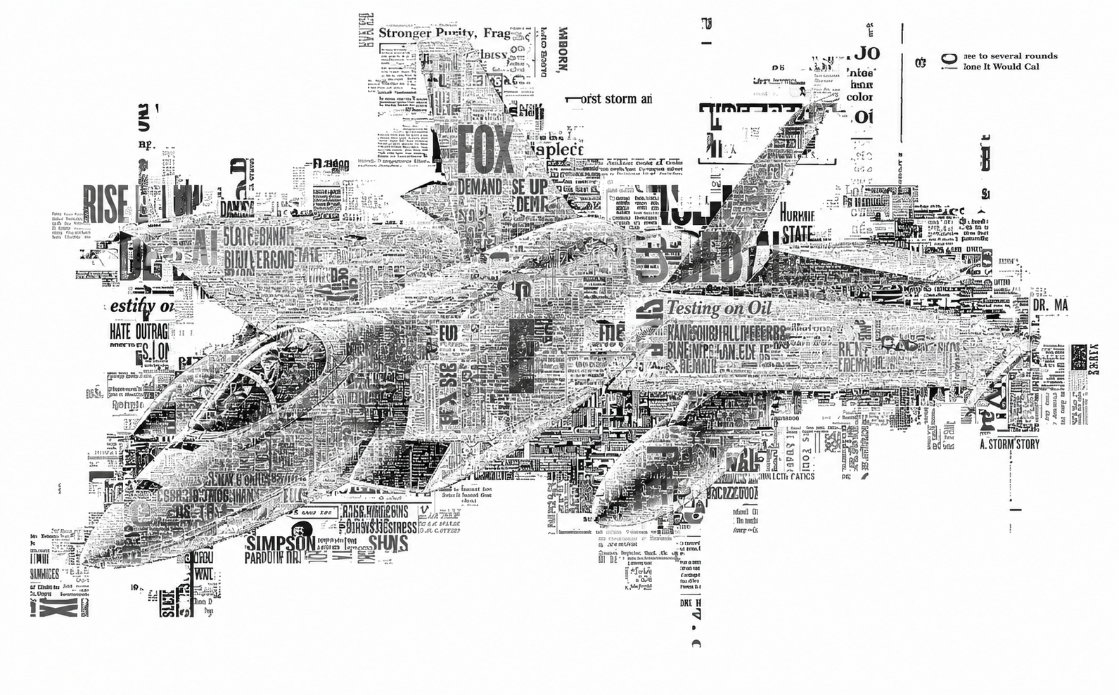
The text is not placed on the image. The text becomes the image.

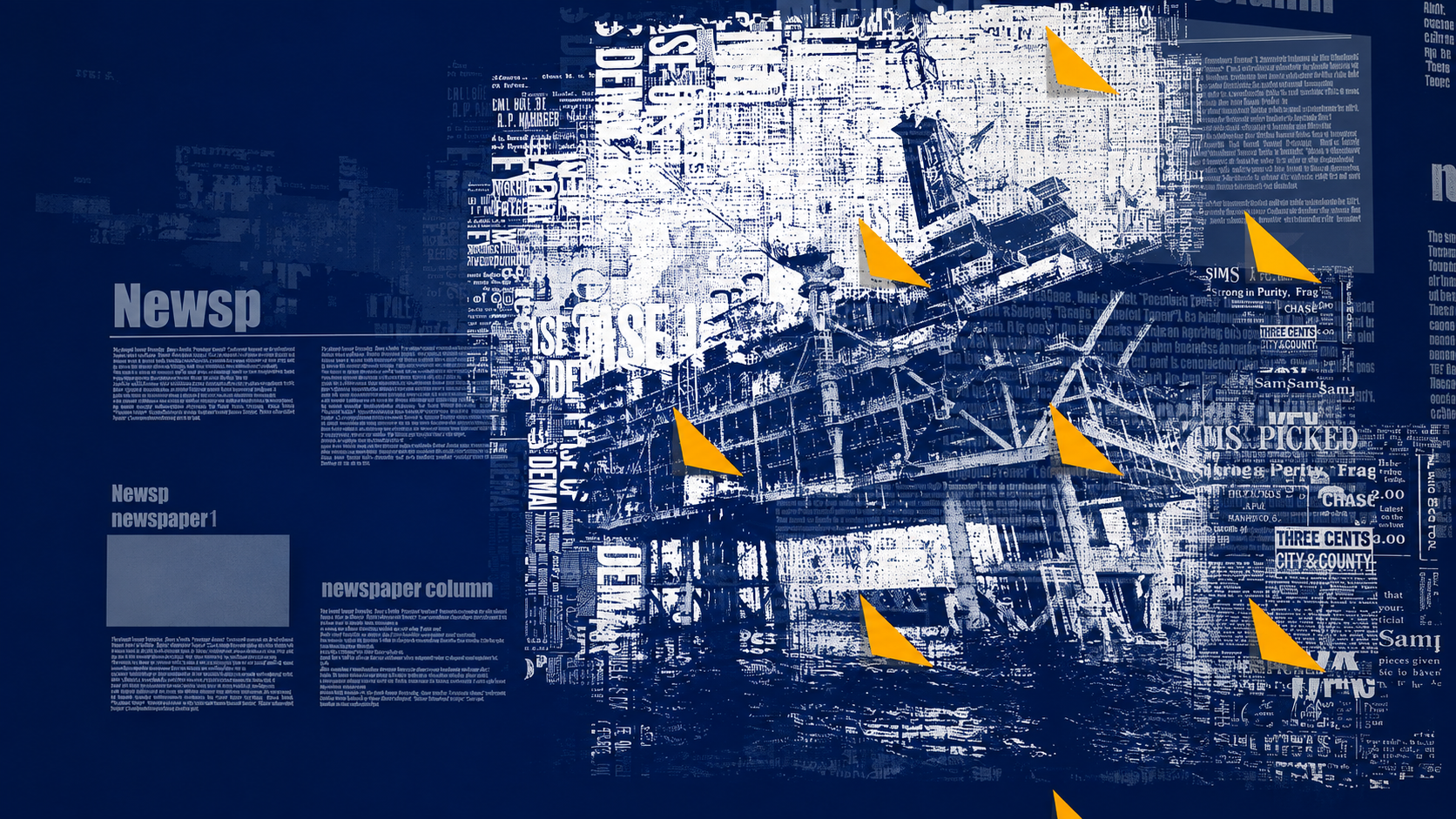
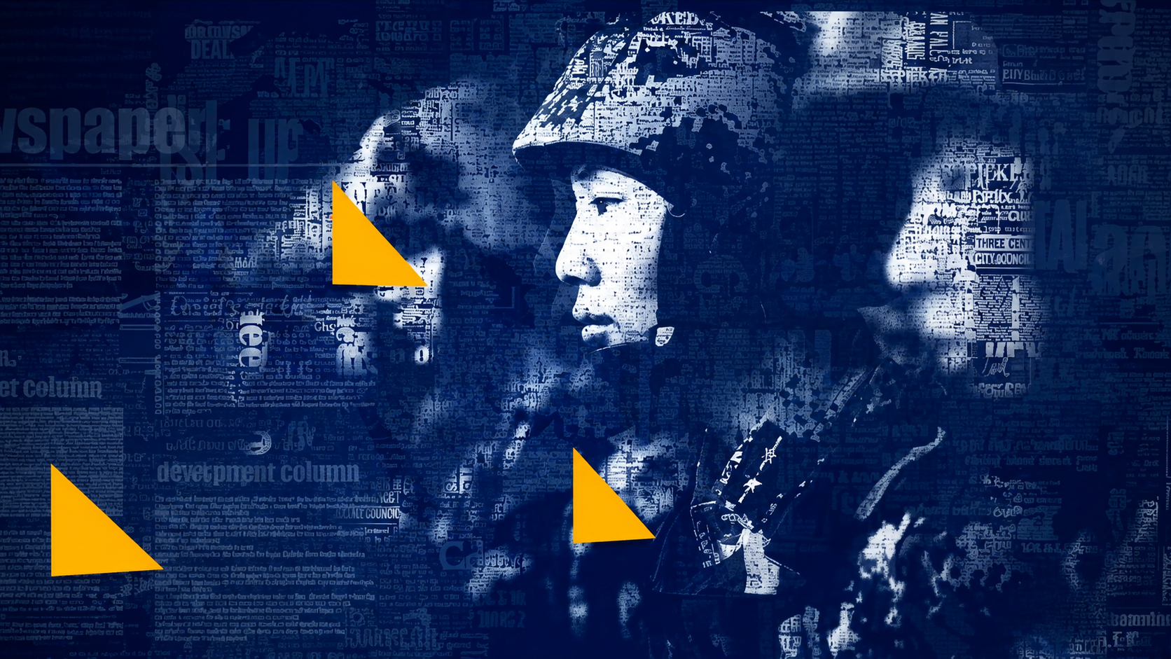
Letters and fragments of printed matter were layered, scaled and repeated to construct portraits, textures and a world map.

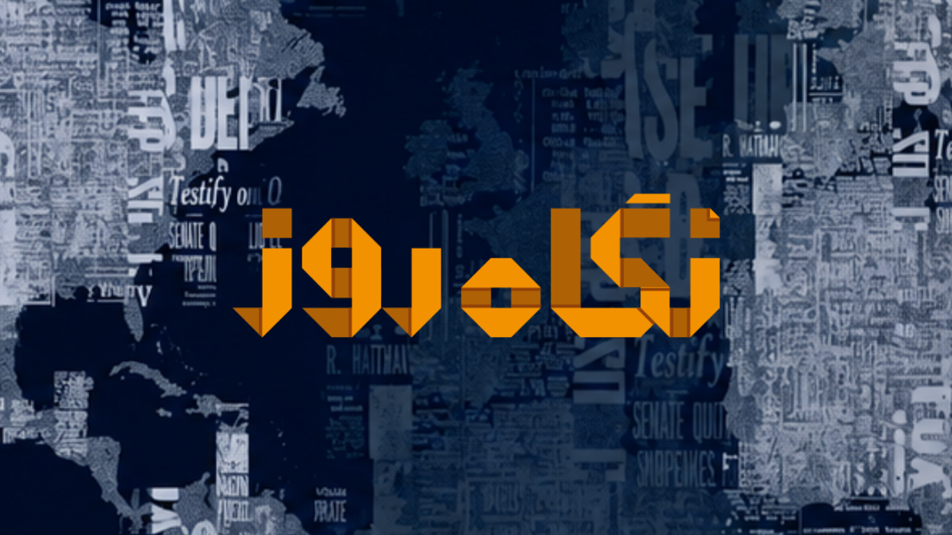
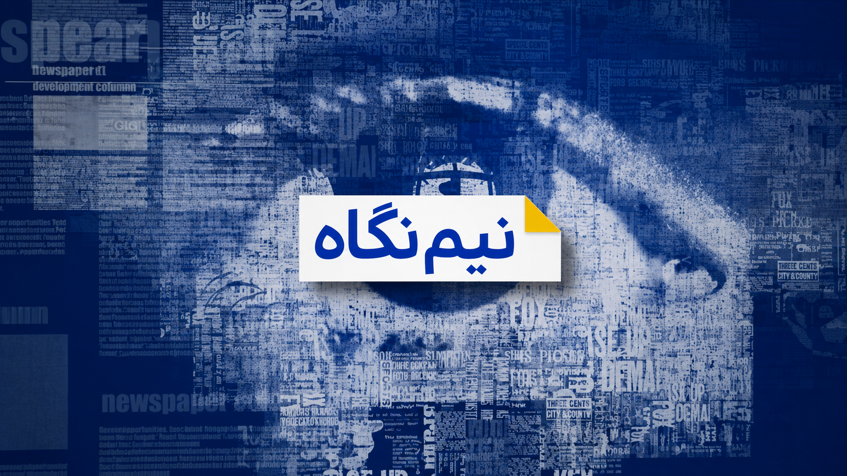
Paper formed the second conceptual element. The folding idea originated in the familiar gesture of folding the corner of a page to mark information worth returning to. This fold informed the programme logo, while its distinctive triangular geometry became a recurring component of the wider motion and broadcast language.

The letter carries the information. The fold marks the information.

Challenge / Question

What needed to be solved.

How can the identity of a programme about published media emerge from the fundamental language of publishing itself? Can typography function not simply as information, but as image-making material? How can one conceptual system remain recognisable across logo, motion graphics, editorial imagery, information design, large-scale video walls and augmented reality? How can the physical language of print be translated into a contemporary broadcast environment without resorting to a nostalgic “newspaper aesthetic”?
Approach & Process

How the idea became a system.

The project began with visual and historical research into lettering, printing and publishing, informed in part by Farhad Nadi's previous experience in graphic design and print production. Typography was then treated as a generative material. Letterforms and fragments of printed information were accumulated, layered, rotated and scaled until they constructed images rather than merely accompanying them. The same method was extended to a world map that could function as an information system. For geographically specific stories, the system could move toward a location, highlight the relevant region using the identity's yellow accent and transition into editorial content. In parallel, the folded-paper principle generated the programme mark. The triangular geometry created through the fold was extracted and developed into a recurring graphic and motion element, including the animated name strap and other broadcast components. These principles were subsequently expanded to large-scale studio video walls, changing editorial environments and augmented-reality newspaper elements.

Motion

From identity to broadcast.

Watch the broadcast example

Outcome

The complete visual system.

The project resulted in a coherent broadcast identity capable of operating across multiple formats and scales: Logo · Opener · Stings · Closer · Typographic Imagery · World Map · Geographic Information Graphics · Full-Frame Graphics · Name Straps · Motion Graphics · Video Walls · Studio Graphics · Augmented Reality · Digital Media Rather than functioning as separate graphic treatments, these applications were derived from a shared conceptual foundation. Letters became words. Words became information. Typography became image. Paper became identity. The fold became motion. Graphics became environment.